G2028
How to Create an Effective Brochure
This guide will help you create a professional, eye-catching, and valuable brochure.
Lisa A. Pennisi, Tourism Marketing Specialist
Yenti Gunawan, Student
Annabel Lee Major, Extension Program Coordinator
Alexis Winder, Student
- Do You Need a Brochure?
- Getting Started
- Creating Your Brochure
- Layout
- Brochure Rack Test
- Don’t Forget the Final Check
- Summary
A brochure is an informational pamphlet or leaflet advertising an organization, business, event, product, or service. Brochures are a great way to package information in a simple, eye-catching design that attracts potential clients by offering basic information. A well-made brochure will grab the attention of the reader and provide needed information while inspiring the reader to take action.
Do You Need a Brochure?
There are many different print and media products that can be used successfully to promote an organization, business, event, product, or service. Before spending time and money on one or more, consider the characteristics of your audience and decide which method(s) will be most appealing.
A brochure is a professional, effective, and inexpensive way to provide information to your target audience. They are designed for people to pick up. Brochures placed in a rack at tourism information outlets, hotels, and motels can publicize a tourism or retail business. Brochures also can describe a program or class that is being offered. While brochures do get the word out, they are not as pervasive as a print, radio, or television advertisement.
Getting Started
Before you begin to write, plan your brochure. Consider the following to help you gather the information needed.
Target your audience by answering the following questions:
- Is your audience specialized or familiar with your subject, or are they a general audience, not in the field or trade?
- How will your audience use your brochure? For example, is it a “how to” that people will keep, or is it to promote a one-time event?
- How will the brochure be used with other marketing tools?
Determine the purpose of your brochure. Are you persuading or informing? Having one primary purpose or approach can be more effective than producing a generalized brochure that tries to say everything and therefore says too much.
Stand out from your competition. Emphasize what makes your business unique. What do you offer that other companies, services, or experiences do not?
Determine the call to action. A call to action is wording that tells the reader to do something. It could be to make reservations, sign up as a volunteer, visit a store, plant water-wise landscaping plants, or fill out and mail in an order form. In your call to action, provide the reader with specific examples and/or detailed instructions to help them take the next step. If you do not include action steps, the reader may lose the point of the brochure or the motivation to take the next step.
Creating Your Brochure
A brochure should be clear, attractive, and brief. Before starting the design process, consider:
Grab attention. If the brochure is in a rack among many, it has to stand out. Make sure the front panel will attract attention by using catchy phrases or images (more on this below).
The entire look. Attractiveness determines how likely a potential customer is to pick up your brochure. The design, including colors, fonts, graphics, and layout, all impact attractiveness. The 5 W’s and one H. The reader needs to understand the information and not be left with any questions. To accomplish this, provide answers to the 5 W’s — who, what, when, where, and why — and the H — how?
- Who is the business or sponsor?
- What is the service or event?
- When is the event? Give the date, time of the event or business operation hours.
- Where is it located? Include a map that shows major highways.
- Why should anyone attend, use your service, shop at your store, visit your website, or take action if this is a public service?
- How can they take the action you want (for example, make reservations)?
Be brief! Most people don’t want to read lengthy text . Wordiness can cause many to put a brochure down. To help determine how much text to include:
- Think of your brochure as an appetizer. It should offer a small taste that makes the reader want more. Share only important and interesting key points.
- Include five or fewer key points. Only use the most necessary information.
- Use pictures, charts, and drawings rather than words when possible.
- Use bullets to break copy into small, easy-to-scan chunks.
Create interest. While getting a reader’s attention may be most important, keeping their interest is hardest. This is where most brochures fail, thus losing a prospective customer. Create interest by appealing to potential clients’ emotions and needs.
Long-term effectiveness. Make your brochure worth keeping. Give your audience a reason to hang on to it, even if they decide not to call or buy right now. Informational brochures containing brief, useful instructions will be kept longer than brochures that do not contain any “how to” details. For example, a brochure that provides people with instructions on how to xeriscape their yard is more likely to be kept than one that that tells them to xeriscape without explaining how. A brochure that describes your business, showcases what you offer, and includes contact information and directions also will be kept longer than one that doesn’t include this vital information.
Organize information. Use subheadings, text boxes, and bullets to break up text and organize information. Readers like brochures that are easy to scan and read in sections.
Avoid copyright infringement. With information readily available on the Internet, it’s easy to break copyright laws, often without realizing it. To avoid violating copyright, seek photos from digital commons areas, obtain permission to use images, and be sure the copyright holder is appropriately cited. Obeying copyright laws and intellectual property rights is a must.
Check the facts. The information you put into your brochure will be in the public eye. Before you hit print, be sure to have others review the facts. If you are uncertain about the information, use your resources, including local libraries and professionals, to review your brochure before you distribute it to the public.
Layout
At this point you have:
- selected a business, service, or event to publicize with a brochure, and
- decided upon the information to include in the brochure.
Next, determine the layout. The way the information is presented helps determine how useful the brochure will be to a reader. Good brochures present a logical pathway through the panels.
|
Size and Format
The size of a brochure is usually determined by the amount and type of information you need to include, and your budget. You might select:
- a simple rack card that is printed front and back but has no folds,
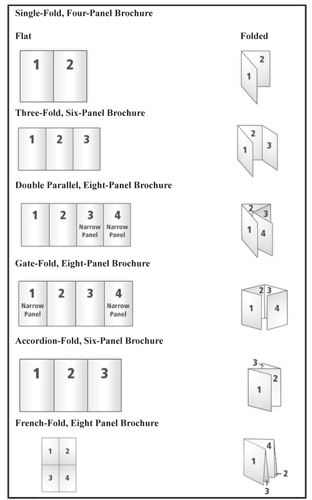
- a brochure with four panels or six panels, or
- a very detailed brochure with eight panels or more.
Remember, making your brochure longer is not always a good idea. People often prefer brief information and may not be motivated to read something lengthy. Also, be aware that increasing the number of panels increases the paper size, thereby increasing cost. The number of folds (or staples) also may increase costs for machine or hand folding. Generally speaking, 8½ x 11 paper works well with a two-fold, four-panel design or with the typical three-fold, six-panel design (Figure 1).
Back Panel
The back panels are an easy-to-find place for contact information. Adding a map next to contact information is very helpful for potential visitors. Make sure the map shows major highways or cities so it is easy for out-of-area visitors and new residents to get their bearings.
Mailing information also can be placed on the back panel, allowing the brochure to be mailed without an envelope, which saves money and trees. The post office has regulations for mailing items without an envelope; be sure your brochure meets all postal regulations.
To print the back panel like an envelope, place your return address at the top left and leave space for a forwarding address and postage. The fold must be at the bottom, and the opening at the top must be taped closed. Always use tape, never staples.
Graphic Design
Effective graphic design helps grab attention. Consider these design elements when creating your brochure:
|
|
To learn more about these graphic design elements, see NebGuide G2031, Effective Graphic Design.
Brochure Rack Test
In a crowded rack, will your brochure stand out visually and create enough interest for someone to pick it up? To help ensure it attracts attention, make the front panel eye-catching by using appealing photos, typography or graphics. One popular technique is to use a cut-out image — where the background has been eliminated. Keep in mind, though, that glossy color images and cut-outs increase production costs. Check your costs and balance those with your needs. You may be able to budget for a rack card with a full-color cut-out instead of a folded brochure. Whatever design you choose, be sure to place the name of your business or event prominently on the top third of the panel.
Don’t Forget the Final Check
- Check spelling and grammar. Don’t rely solely on spell-check because it won’t identify words used incorrectly but spelled correctly, such as it’s and its or where and were.
- Watch for widows and orphans. A widow is the last line of a paragraph that appears as the first line of a new page. An orphan is a paragraph that starts at the end of the page and contains just one line. Use spacing or delete items to prevent these.
- Include costs, such as admission price, when possible. The lack of this information could prevent potential customers from visiting or using your services. Including this information can prevent customer dissatisfaction should someone arrive expecting something for free only to discover there is a cost.
- Double check that the five Ws and one H — who, what, when, where, why and how — are prominent.
- Check for
- your company name and logo, and
- contact information, including address, phone number, email, and website address;
- Explain how to use your services or take action.

- The theme is well developed and used throughout the brochure.
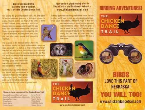
- The design is eye-catching.
- It passes the brochure rack test by presenting important information in the top one-third of the front panel.
- Good design techniques are used, including balance, proximity, and color throughout.
- Brief blocks of text helps readers focus on information important to them.
- Information covers the 5 Ws and H.
- The choice of font helps create interest.
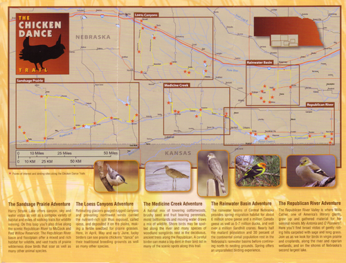
- A good deal of useful information is included, along with attractive images and graphics.
- The map is easy to read and will help potential visitors understand how to get there.
- Website information is displayed prominently, which helps visitors meet the action goal of visiting the website.

Figure 2. An example of a well-made brochure. (Photos by Don Brockmeier, www.chickendancetrail.com) Summary
Brochures are a simple and affordable way to communicate with a selected audience. Now that you have the tools to produce an effective brochure, don’t be afraid to use this marketing tool to your advantage. Brochures can be used to provide information explaining what you do and/or why you do it. Or, a brochure can be the foundation of a more extensive marketing campaign. Either way, by producing an effective brochure, you are providing your audience with a tangible document that communicates the most important information in a colorful, well-designed, and informative package.
This publication has been peer reviewed.
Visit the University of Nebraska–Lincoln Extension Publications Web site for more publications.
Index: Communities & Leadership
Small Businses/Entrepreneurship
Issued January 2011
